
I really love Zurb Foundation. It's allowed me to quickly get a simple little "timer" app off the ground for a friend of mine. The "reveal" library makes for simple modal windows of varying sizes. However, I really wanted to get a full screen reveal window to work with. After a few tweaks I made it happen!
Taking the default reveal code, and using the "expand" size option, you can generate a modal like this:
To make this full size. We take three simple steps:
1. Update your CSS body/html tags have 100% height.
The browser doesn't do this by default, so add the following CSS somewhere:
body, html { height: 100%; }
2. Create an overriding classes for our full size reveal.
We don't want to break the functionality of our other reveal classes, so we can create our own "overriding" class with the details we need:
.full-modal
{
    background-size: 100% 100% !important;
    background-repeat: no-repeat !important;
    height: 100% !important;
    top: 0px !important;
    left: 0px !important;
    margin: 0px 0px 0px 0px !important;
}
If you were to look at the base reveal class, it does some margin modifications to place the reveal window in the middle. We force all of this back to the 0,0 coordinates to coincide with our 100% height. You'll notice I have some background modifications as well. This is to accomodate for the background images I'm adding to my reveal window. You don't have to worry about those if you aren't working with image backgrounds.
In addition to this, we need to override the positioning of the closing X button that you can add to a reveal window:
.close-full-modal
{
    position: fixed !important;
    top: 5px !important;
    right: 5px !important;
}
3. Calculate our full width upon opening.
Since the full width of the page body isn't available to a hidden item, we wire up the reveal:opened event in JavaScript to get the width of the body and set the width of our reveal window accordingly.
$('#clock-modal').bind('reveal:opened', function()
{
    var timerBox = $('#clock-modal');
    timerBox.css('width', \$('body').width()); StartTimer();
});
I bet there is a way to do this with SASS, but I'm not that saavy yet. I'd love some comments or alternatives.
4. Apply our classes and see the results.
Here's our updated reveal window (notice the full-modal and close-full-modal additions:
<div id="clock-modal" class="reveal-modal full-modal">
<div class="row">
<div class="twelve columns" style="text-align: center;">
<div id="clock-display">Go!</div>
</div>
</div>
<div class="row">
<div class="twelve columns" style="text-align: center;">
<a id="button-pause" class="radius button" href="#">Pause</a>
<a id="button-resume" class="radius button" href="#">Resume</a>
<a class="close-reveal-modal close-full-modal">×</a>
<img id="img-logo" src="assets/logo.png" alt="Game On Logo" />
</div>
</div>
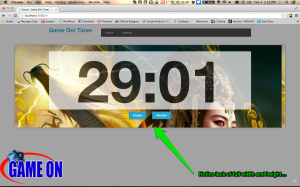
</div>and here's the result

Final Thoughts
So far this setup has worked on my desktop, tablet (Nexus 7) and even an older mobile browser (HTC Thunderbolt) with full screen. There may be some ramifications that I haven't seen yet with Zurb and this setup, but hopefully I have things setup to not conflict.
I hope this helps. Drop me a line if you see a way to make it better!