As I’ve been working through my Prayer Journal app (I’m looking for beta testers now if you’re interested) I’ve been trying to find a way to replicate the “card experience” that you find in a lot of apps nowadays. A simple left/right swipe will allow you to browse all of items in a list you have generated. It is rather intuitive and very mobile friendly. I’ve been building Prayer Journal using Zurb Foundation for Apps (Z4A) and love it. The one thing I haven’t found yet in the framework is a way to build such an interface. With some additional library support however, you can make this happen.
To start, we’ll put together a simple unordered list and for each list item, we have take advantage of the card layout provided by Z4A. In addition, we install a great angular touch carousel library that installs easily into your application through bower. Make sure to update your app.scss to include the angular-carousel.css file, as well as update your gulp script to copy all the appropriate resources during the build.
Once that is in place, we can setup a simple unordered list with our card details:
https://gist.github.com/1ece61cf172cee97ba2d
Now we have to do a few CSS tweaks.
The first is that the “active” color for the carousel indicator is set to white, which you can’t see on our screen. Similarly, the navigation arrows are at the bottom of our card. We’ll change the color and move the controls to the top.
.rn-carousel-control { top: 0em; }
div.rn-carousel-indicator span.active { color: #00558B !important; }
Next, we don’t want the navigation controls to be displayed on smaller screens, since we’re relying upon the swipe. Thanks to "mixins" with our SCSS, we can create a special rule for that:
.rn-carousel-control { // Only affects medium screens and smaller@include breakpoint(medium down) { display: none; } }
Finally, because of how the grid leverages flexbox and how the carousel uses relative positioning, we have to set a fixed height for the carousel control. For a uniform look, I also set a fixed size for the cards themselves:
.prayer-carousel { height: 450px; }

.prayer-card { height: 400px; }
I’m hoping to find a way around this, as I’m not a CSS guru. Any CSS gurus (or Zurb developers) our there please send me word if you know a way around this.
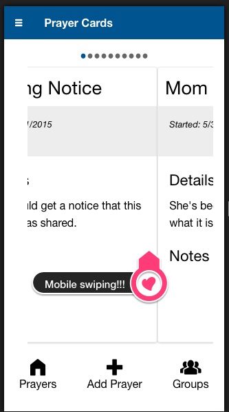
With that in place, run your gulp build command and fire up your app. You’ll see a nice looking card display (like the screnshot above) that by using your finger, you can swipe left and right to navigate through the cards on your mobile device. You can also click/drag on your computer, but for convenience the navigation controls are displayed there.
The only two “gotchas” to this setup. The first is the above mentioned fixed height needed for the carousel. Ideally we wouldn’t have to hard code the height this way, though coding the cards themeselves for a fixed height is a good for a consistent view. The second is that the carousel library depends upon ng-touch for the swipe actions, while Zurb Foundation for Apps uses hammer.js. Ideally you want only one “swipe” library, so I’ll have to look into possible recoding the carousel to rely upon the hammer events.
That’s all there is to it! I’m looking to take advantage of some of the features of the carousel to add/remove items based off of filter conditions, but that is still a work in progress.
Enjoy!